MCPASD’s recently refreshed logo is a powerful symbol packed with meaning, and the students who drove the redesign process are sharing their excitement for the unity, growth, and strengthened identity it will bring to the District community for generations to come.
“I hope the community can just connect with it,” said Izzy Frantz, one of the Middleton High School CAPS student ambassadors behind the redesign. “I hope they see the values that we have here are strong, and that through the logo, this is a place where they would want to be.”
Frantz worked with her fellow CAPS ambassadors Mason DePauw, Rohan Dileep, and A.J. Schleusner over the course of several months last year to bring forth the new logo. They participated in branding workshops with the MCPASD Communications Team and shared their feedback and experiences in the District to inform the entire process and keep it student-led. They revealed the logo at the Dec. 15, 2025, Board of Education meeting.
“I really hope it’s something that just connects with a ton of students,” Schleusner said. “I really hope it’s something that not just one type of person can really see something in…but something we can all just collectively look at, appreciate, and see something of ourselves in.”
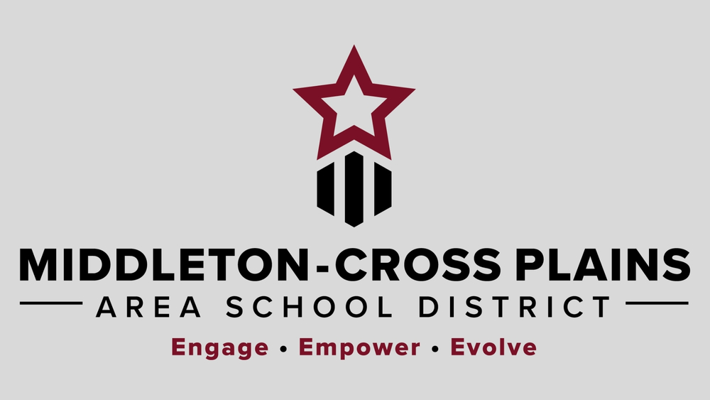
A key element of previous District logos was the star, which the students were passionate about carrying forward. They felt that the previous representation of the star looked broken, and in order to strengthen it, wanted to show it moving forward into the future.
“A big part of our logo is having a star getting into places, having a goal and getting there, and getting things done,” said DePauw. “I hope that when people see that – wherever they see it – they get that message from it, and they feel more confident about maybe bringing a new student into the District.”
The new logo depicts the star, representing MCPASD students, moving upward and breaking free from the three pillars, which form a hexagon shape that provides a foundation and sense of strength. Together, the star and the pillars also form an arrow, which represents growth, direction and momentum.
“When talking about showing Middleton-Cross Plains as this district that is the best, really, across the state, we really want to show a logo that represents that and has a strong foundation,” said Dileep. “That will really help us succeed.”